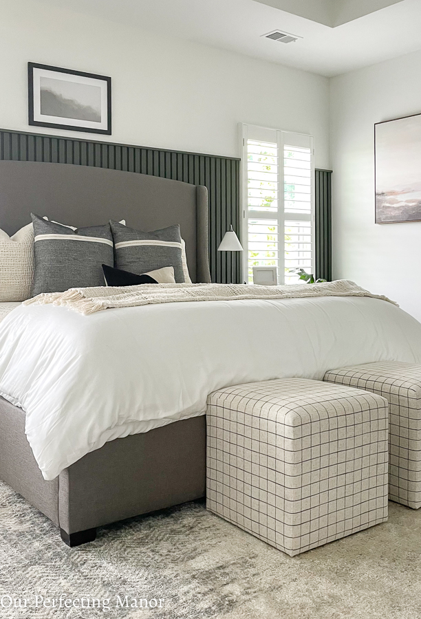
The owner’s bedroom refresh and reveal is finally complete, and I couldn’t be happier with the results. It took some time, energy, money, and a lot of contemplation; however, it came together just the way I envisioned it. I shared a lot of behind the scenes with you and one actual photo via Instagram; however, today I want to give you all of the details of this makeover. I hope you enjoy the tour!
Owner’s Bedroom Refresh – Before Pics
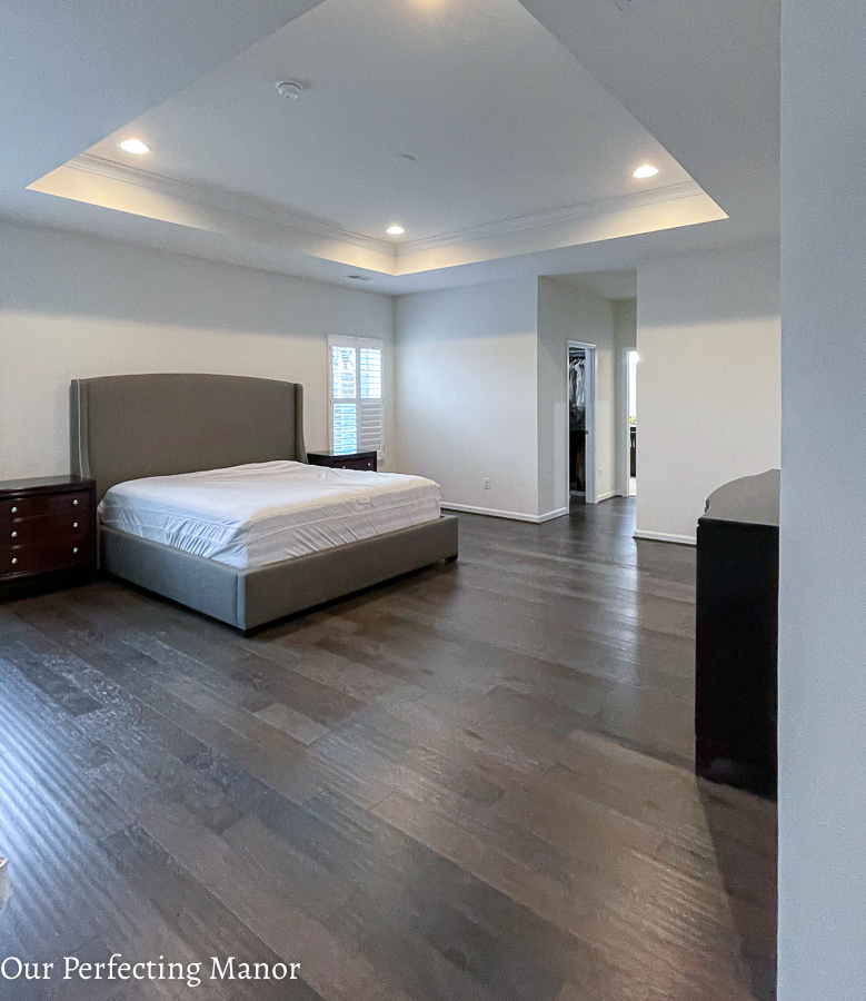
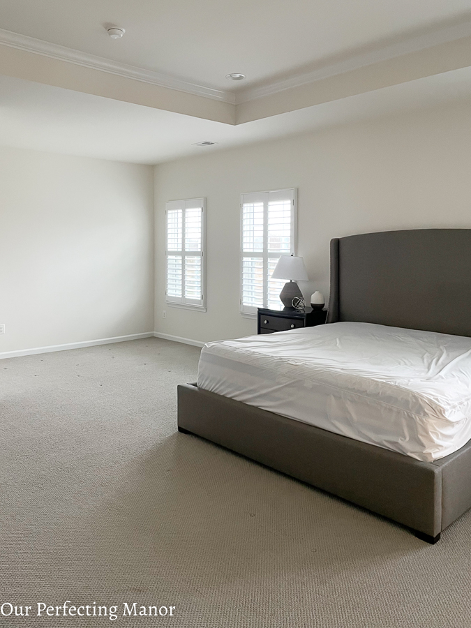
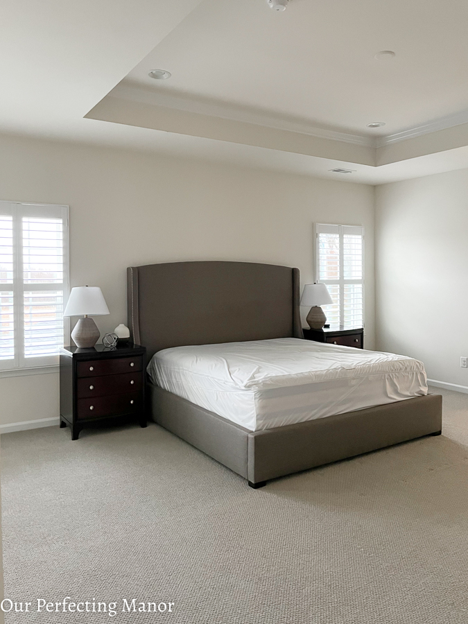
My bedroom is pretty long and has a sitting area that I absolutely love and was a must-have when building this home four years ago. As you can see from the before picture, this space was a blank canvas and was pretty bland. As a Mommy, I put my children first so I made over their bedrooms last year during the pandemic. When 2021 rolled around, I decided it was finally time to bring the vision I had for my bedroom to life. The look I was going for started off as a refined modern farmhouse look; however, it morphed into a modern, refined retreat.
The inspiration for the color palette for my room makeover is this Studio McGee Dreary Abstract Landscape canvas art. Using the Sherwin Williams website, I was able to upload a photo of the artwork to identify a color palette. So, my color palette is a mix of greens, grays, whites, and bronze.
Let’s start at the very beginning of this makeover. My cleaning crew decided to place bottles with bleach on the carpet adjacent to the owner’s bathroom. That left a couple of rings in the carpet, and I just knew it was time to rip of the carpet and extend the engineered hardwood flooring into my bedroom. Although I wasn’t ready to spend the money on new flooring, I knew it was time to get the look I desired for this space.
Hardwood Floor Installation
I had the same contractor who initially installed my engineered hardwood floors come in and install the same Armstrong Rural Living engineering hardwoods in Misty gray. Naturally, the gray color gives my bedroom a warm, moody modern feel. As you can see, the engineered hardwood floors extend from the upstairs loft/landing area.
Vertical Slat Wall Installation
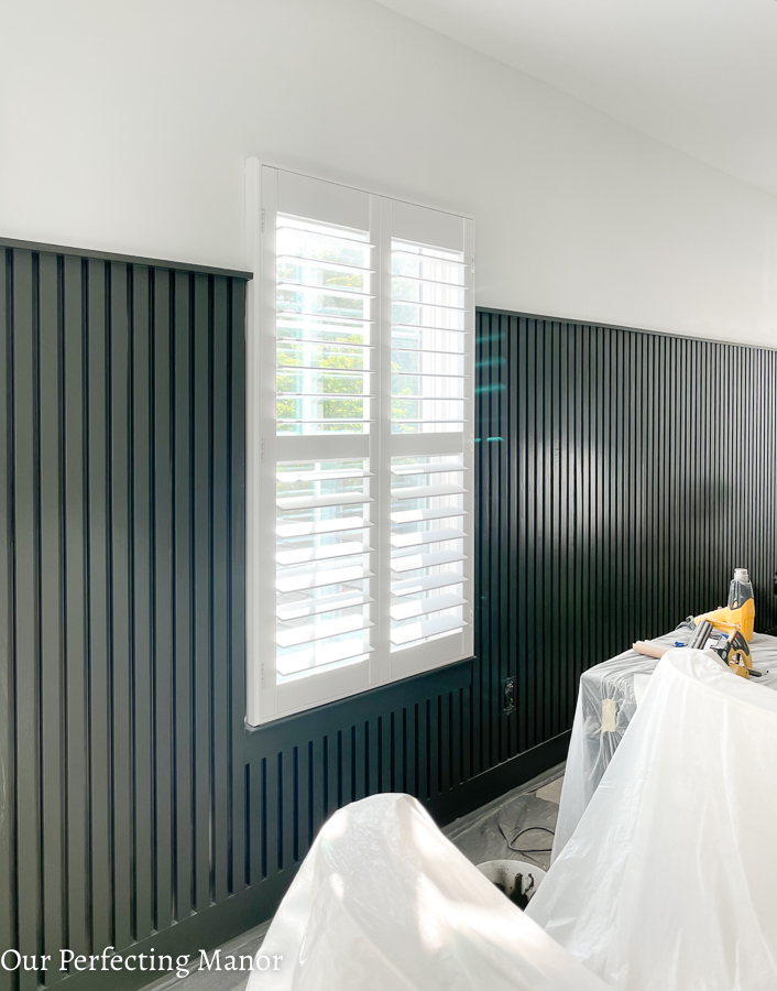
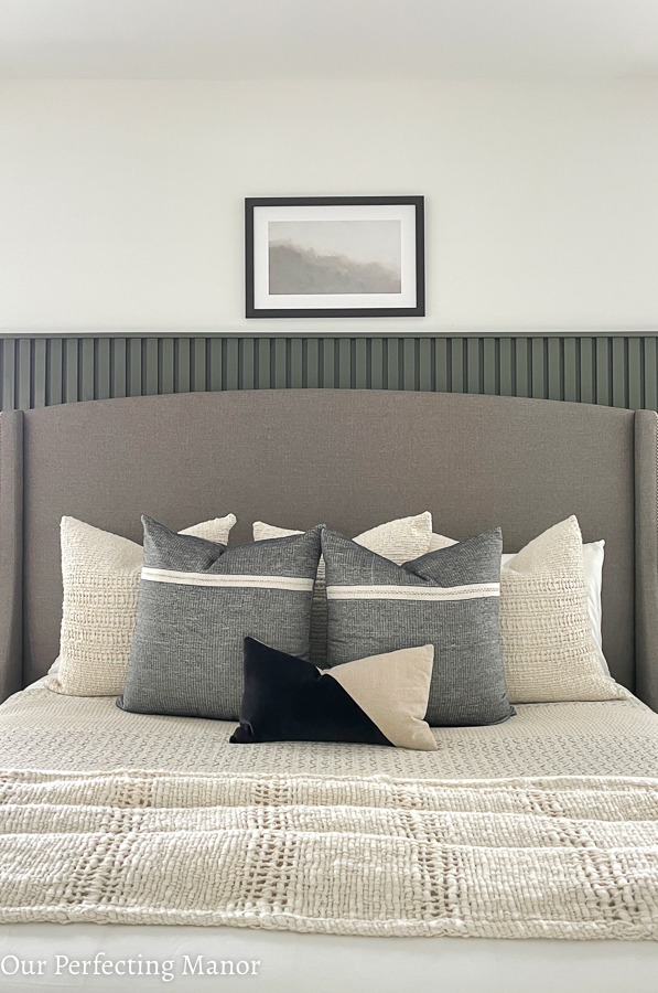
Once the engineered hardwood was laid, it was time to focus on the accent wall. I was on the fence about a traditional wood trim accent wall versus a more modern slat wall look. In the end, I decided on the slat wall since I was moving away from a modern farmhouse look to a more modern refined look.
It took my contractor roughly two days to install the slat wall primarily due to the lack of 1×2” pieces of trim at Home Depot. They ended up ripping some 1×4 inch boards down to a 2-inch slat.
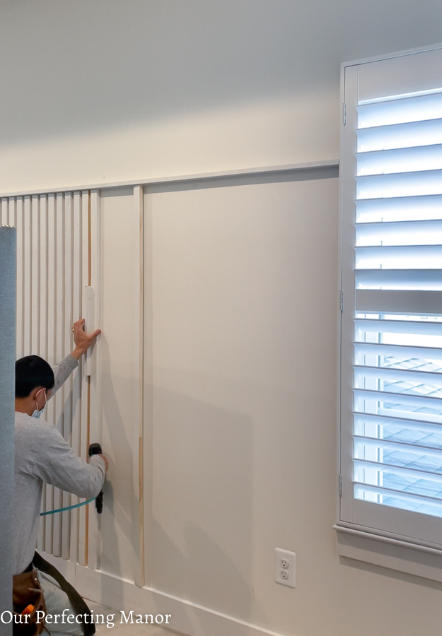
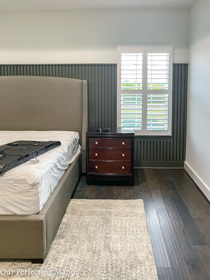
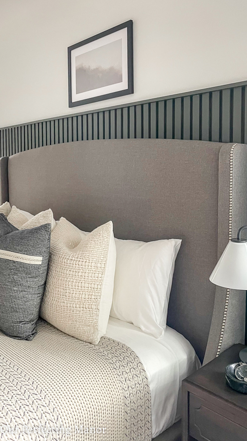
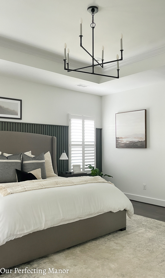
Due to the height of the headboard, we took the accent wall up to 67”. The contractor initially painted the slat wall Pure White by Sherwin Williams in a semi-gloss finish. I also had the contractor install new baseboards since we used the 1×5” as the baseboard for the slats.
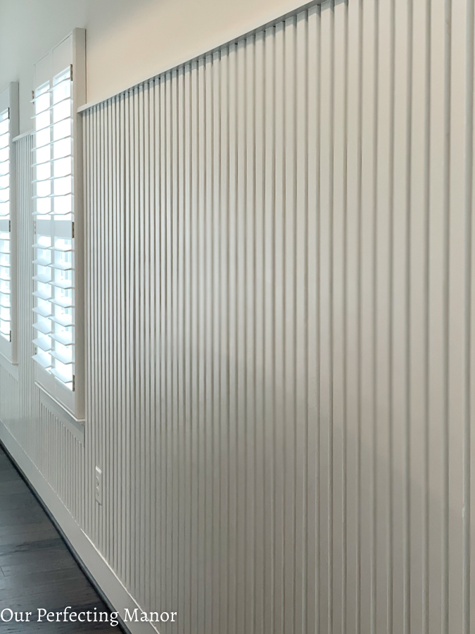
After a week, I decided to switch things up. My contractor repainted the slat wall Iron Ore by Sherwin Williams. Using this color allowed me to get the moody vibe that I was going for. I threw caution to the wind and decided to stretch myself with the overall design of this space.
Painting
My painter also painted the walls using Pure White by Sherwin Williams in a flat finish. This paint color works with my neutral palette and provides enough warmth to compliment the dark green accent wall.
DIY Accessories
Once the room was painted, it was time for me to jump in a DIY some things that will personalize my owner’s bedroom refresh project. I DIY’ed a few vases with colors that fit into my color palette using baking soda and paint. This footed bowl was black; however, I wanted to incorporate Sherwin Williams Urban Bronze into my space. The baking soda and paint gave this footed bowl a textured look and feel that I’m loving.
In addition to the footed bowl, I also took these At Home low vases and painted them Attitude Gray and Agreeable Gray from Sherwin Williams using paint and baking soda. The Agreeable Gray paint was leftover from my office walls, and the Attitude Gray was a sample paint that I picked up from Home Depot. If you love the shape and size of a vase, go ahead and upcycle it to fit the look and feel you’re trying to achieve.
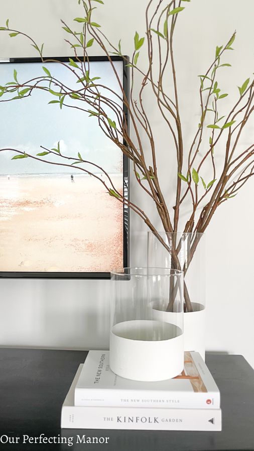
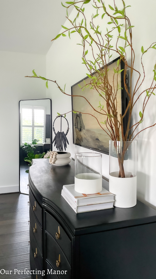
Another DIY tI tried was the dipped vase look using cylinder vases, paint, and baking soda. These vases typically sell for over $100. I was able to repurpose cylinder vases that I already had and some leftover white paint. I marked and taped off the location of the cylinder that I wanted to paint, and I painted everything below the painter’s tape. It was a fairly easy DIY and was a fun project to take on.
I knew I wanted to add real plants when planning the owner’s bedroom refresh. When looking for planters, I just couldn’t find the colors, shapes, and sizes I needed for my new plants. So, I used spray paint and just regular latex paint (with baking soda) to transform these planters into Iron Ore green, and black matte planters. They are the perfect fit for my new plant babies, and I just hope I can keep them alive. Let’s pray that I keep this monstera and fiddle leaf fig plant alive.
DIY Canvas Art
Have you ever found the perfect size canvas art, but the frame and paint colors are less than desirable? Well, that happened to me when I found this Sarah Brooke piece at HomeGoods.
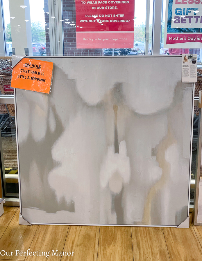
Of course, I was not going to let that deter me from the look that I wanted in my sitting room. So, I headed over the Michaels to pick up some acrylic paint. I ended up using dark brown acrylic paint to change the color of the frame. It came out beautifully! Then I decided to mix up some acrylic paint to give them canvas some new color and movement.
I initially went too dark with the gray paint, so I stepped back and decided to use a mixture of gray and green for this look. While playing around with leftover paint, I created several colors that fit within my color palette. I absolutely love the modern aesthetic it gives and pairs extremely well with the landscape pieces I have in the space as well.
The additional framed landscape downloadable art is from Collection Prints, and it’s called Reflection. I framed it through Frame it Easy, and the frame was gifted. The frame size is roughly 25×16, and the art is 19×10. This was such an easy and inexpensive way to get great-looking artwork.
Dresser Makeover with Jolie Paint
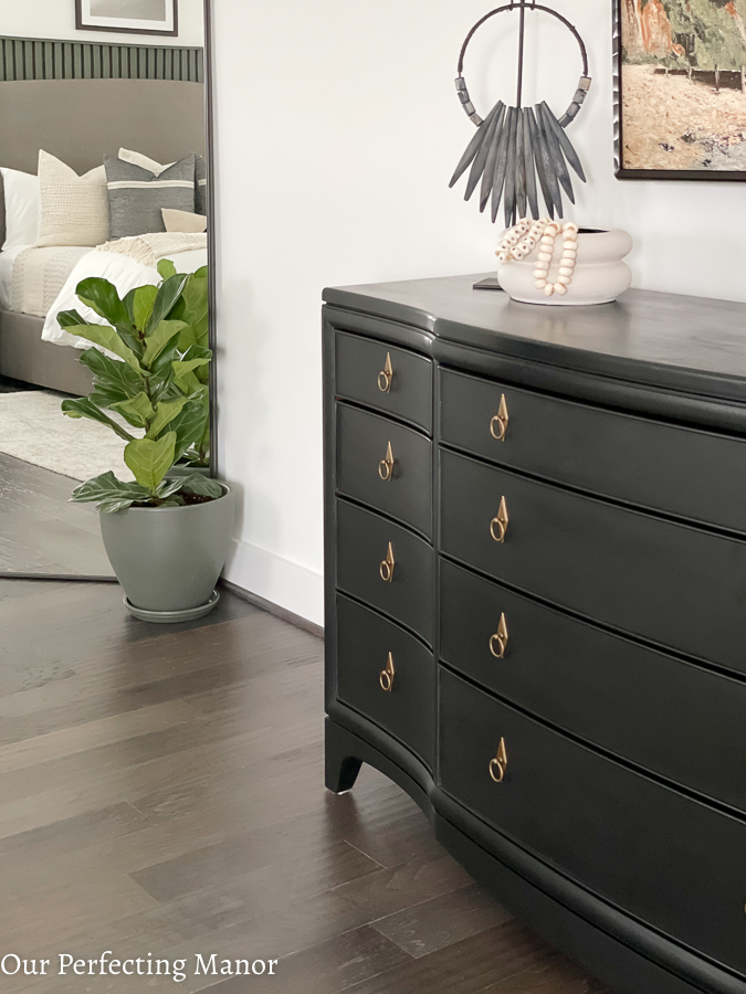
Now, for the biggest DIY project that I took on for this owner’s bedroom refresh….the painting of this a 16-year-old triple dresser. I knew this particular project would challenge me to no end; however, I was determined to repurpose this dresser and save money. First of all, it is almost impossible to find a triple dresser these days. Couple that with the cost associated with such a purchase and it was a no-brainer.
Honestly, the prep work was pretty easy! I did some light wood filler and sanding, and I was off to the races. My initial mistake was not adding water to the paint, so I ended up re-sanding and re-painting the dresser again. I’m thinking of sharing my experience with using the Jolie Paint to upcycle this dresser in another post, so I won’t provide too many details here.
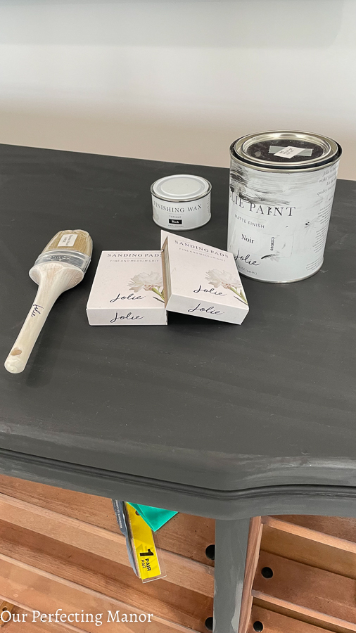
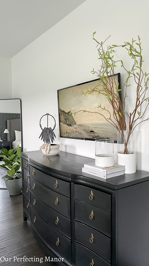
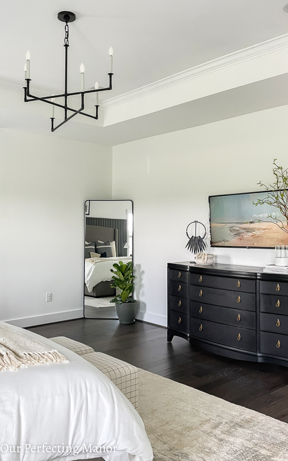
The color I used was the Noir in the Jolie Paint line. It’s the perfect color black, and I love the matte look. I used black and clear Jolie finishing wax to protect the dresser after I painted it.
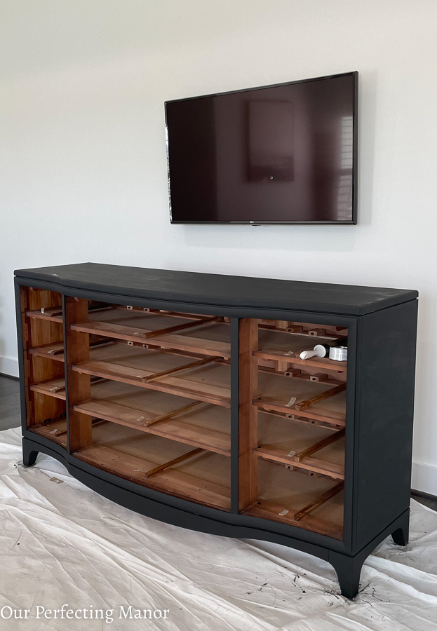
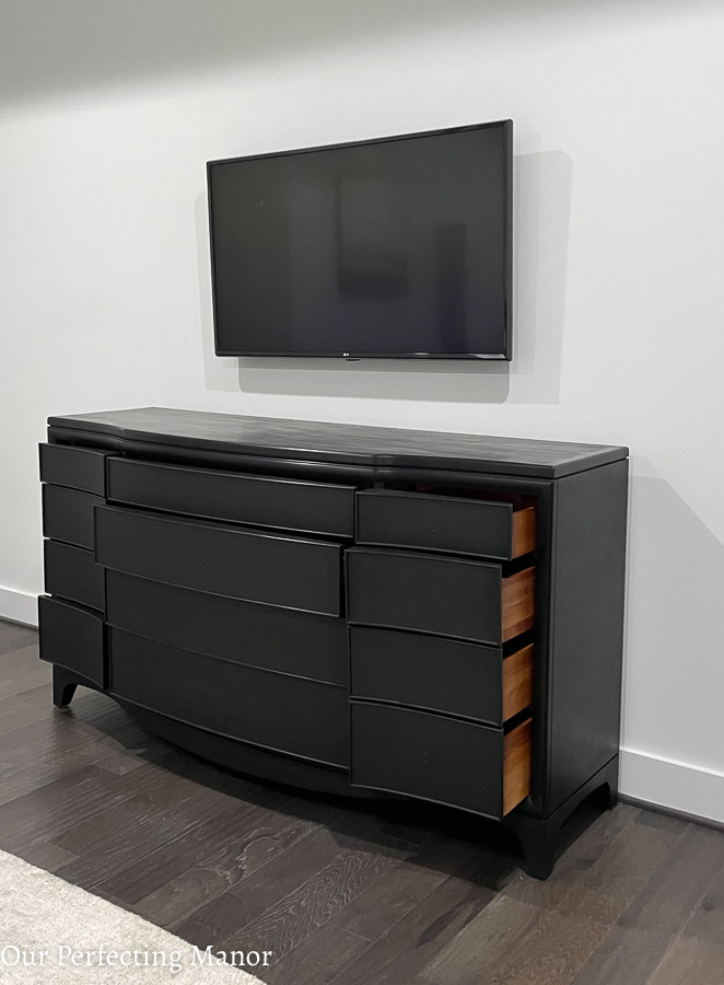
As you can see from the original look, the hardware really dated this dresser. It was chunky with a brushed nickel finish. Once we finally got the hardware off….it took a lot of muscle and brawn—I found this gorgeous drop pull from Forge Hardware to accessorize my upgraded dresser. I had to get longer screws because of the depth of the drawer fronts, and my handyman cut them to the precise length. Overall, I think the dresser repurpose was a success. I would like to add another layer of wax using cheesecloth soon.
Owner’s Bedroom Refresh – Sitting Area Reveal
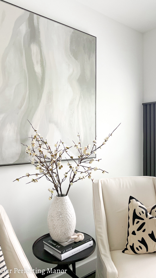
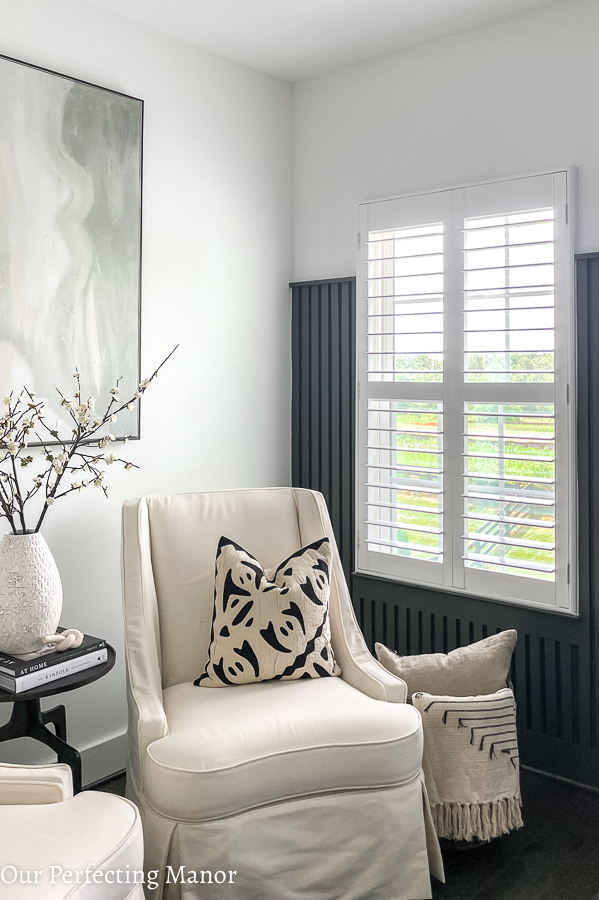
The sitting area of this bedroom is one of my favorite spaces to sit and read. I love the natural light that peeks through later in the afternoon. These chairs are old wingback chairs that I’ve owned for 6 years. They are slipcovered in this Revolution Phoenician fabric, and the color is ivory. Undoubtedly, the upgraded look gives the once colorful chairs a new, modern look.
I finished off this space with some modern accents to include these West Elm pillows and throw, CB2 vase, books, and this cute knot from Etsy. The lamp is old, and I painted the shade using fabric spray paint from Michaels.
Updated Bedding from West Elm
Can you believe I use to have the typical dark ebony wood bedroom set in the owner’s bedroom? Well, that was before I purchased this Berndhart Cooper bed (tall headboard) from a local furniture store. The best decision ever to fix the tragic design mistake I made 16 years ago.

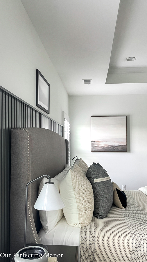
All of the bedding is from West Elm, one of my favorite places to shop these days! The Tencel cotton sheets and duvet in white were West Elm outlet finds and were inexpensive. The pillows, blanket, and throw were all purchased either online or in the store over the past two months. I think the stark white bedding is warmed up against the black and ivory accents in the rest of the bedding. I do not want to sleep in this bed since it is styled to perfection, so let me just snap about 100 pictures before I retire later this evening.
Nightstands and Minimal Styling
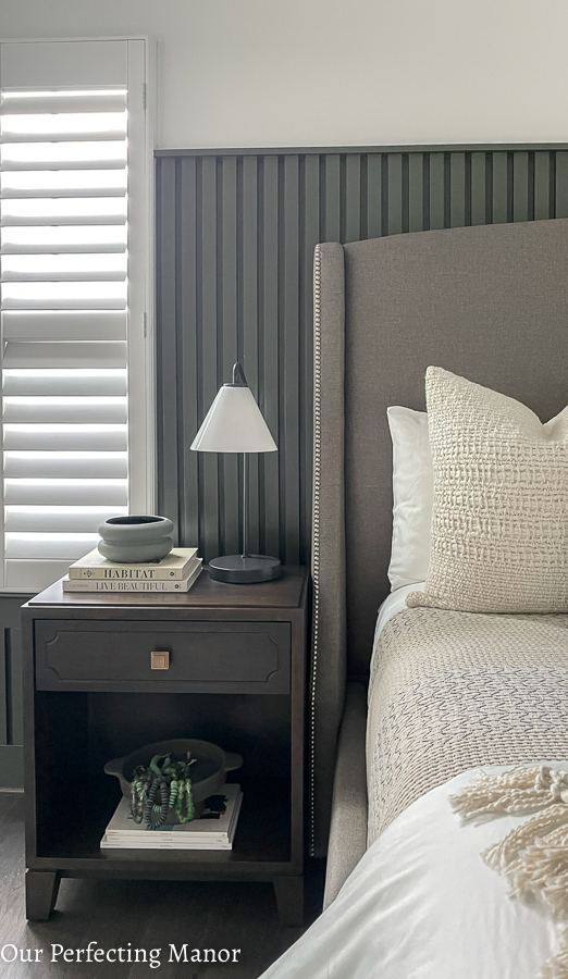
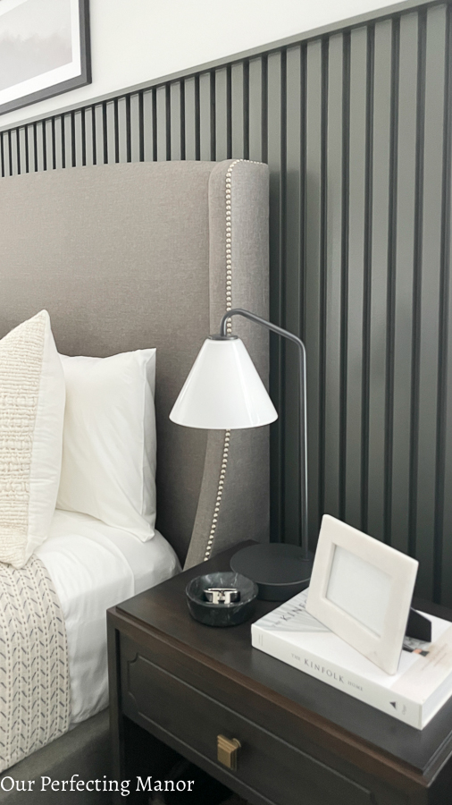
Although I was willing to keep the triple dresser, the nightstands had to go! I replaced them with these modern gray, low-profile nightstands from Greenfront Furniture. Since the pandemic was raging and furniture is scarce, I opted for a local deal. They were a bit pricey, however the quality (soft close with real wood dovetail drawers) is unmatched.
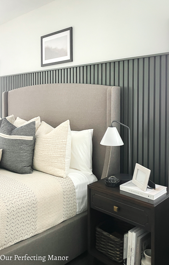
I accessorized these nightstands with minimal décor; however, books are a must. Not only do I love reading them, but they also look great perfectly styled with my minimal décor pieces. By the way, I’m obsessed with these Kinfolk books, and I plan to purchase more. In addition, these West Elm Sculptural Cone Table Lamp (with milk glass)
West Elm Chevron Rug
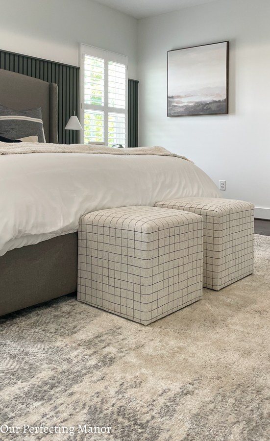
Can you talk about a steal of a deal? This gorgeous 9×12 ivory and grey modern chevron rug are from the West Elm outlet too! It was such a great deal and was well worth the drive up to Pennsylvania! It was so long, they folded it into a square and stuff it in my SUV. This particular rug is not available online, so I can provide the actual name of this rug. Please know that this rug is super soft and very beautiful in person.
Generation Lighting Chandelier
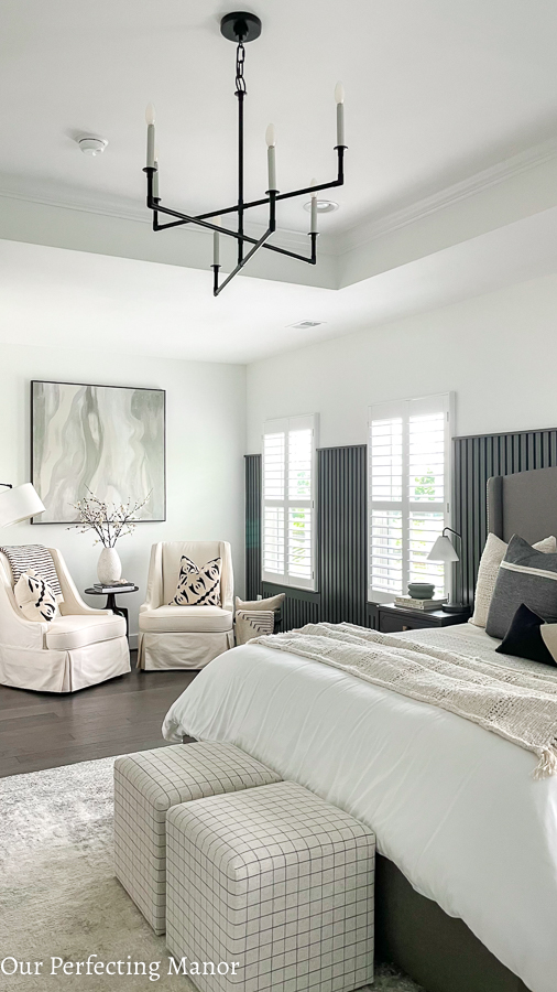
Now for another splurge in my owner’s bedroom refresh – this Bayview Generation Lighting chandelier which was designed by Chapman & Myers. It’s such a gorgeous minimal look, and the aged iron metal gives my space a modern refined look. I got the medium size for this space, and it fits the tray ceiling flawlessly! I really wanted to get the matching sconces for my sitting area; however, I waited too long to make up my mind to cut holes in the wall/ceiling.
West Elm Floor Mirror
The last splurge for this space is this West Elm Modern Streamline Rounded Edge Floor Mirror. I eyed this mirror for several years, and I finally splurged on it for this owner’s bedroom refresh. It completes that corner so well, and I’m glad I decided to strap it to the wall. I purchased it in antique bronze, and it comes off as black in person.
I hope you have enjoyed the journey of seeing this owner’s bedroom refresh. It was a fun project to take on, and the ability to execute my design skills was stretched beyond what I could have ever imagined. If you’re interested in seeing last year’s bedroom makeover, please click here to check out my daughter’s Modern Boho-inspired bedroom. Also, you can follow along with the updates to my home over on Instagram here.
Please drop down in the comments and let me know which of my DIYs were your favorite.



You are very talented. I love everything about this room
Thank you so much! I would love to help you out with your bedroom! Are you ready?